A new reality
At times, it seems as though we are living in a world driven by chaos. That there is more that divides us than unites us. In reality, we are far more connected than meets the eye. And with each passing day, we become even more so.
That’s because modern life has unmistakably bound us through a common human circumstance — sharing personal data is now an everyday fact. Work requires our personal information. Technology connects our relationships. And the more data we share, the more we have to lose.
When InfoArmor was founded, it was based on one core belief: Everyone deserves peace of mind. More than a decade later, this is still why we get out of bed every morning — to protect the places people work, the relationships they build, and the data they share. We have to do this for more than just ourselves. We have an obligation to improve the world for our family and friends, our colleagues and our rivals, our employees and our employers.
A new opportunity
As we thought about our future, we tested how well our brand communicated our vision, and we found that we had room for improvement. We interviewed our customers, tested new ideas, spoke with our clients and partners, and too often we heard words like “dated,” “corporate,” and — perhaps worst of all — “expected.”
Our previous branding served us well and got us where we are today, but we knew the InfoArmor brand identity was ready for an evolution, one that reflected our commitment to our customers, our big aspirations, and our mission to secure all humanity.
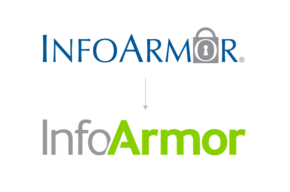
We found that what distinguishes us is our name: InfoArmor. In an industry of locks and shields, it was time to retire our logo and stand out for who we are and what we do for our customers, not for what our logo is.
We know that people will likely only remember a few things about us, and we wanted to make sure they remember the core values we are trying to express: that our customers are at the center of everything we do, and that we believe everyone deserves peace of mind.
We discovered that with simply our name, people inherently recognized what we do, which is more powerful than any icon. Our new logo is designed to give a fresh, sleek, and modern feel. We selected green as the primary color because it represents growth, safety, prosperity, and stability. The “Armor” is protecting the “Info” — a symbol of our mission to secure all humanity.
In its simplicity, we found the future.
More than meets the eye
InfoArmor is more than just an identity protection service, but our research found many visitors didn’t realize this.
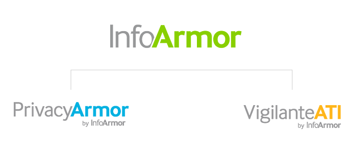
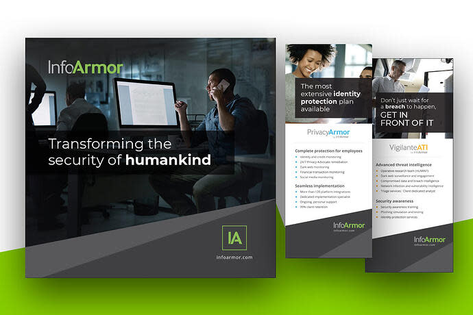
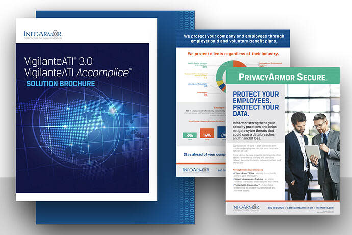
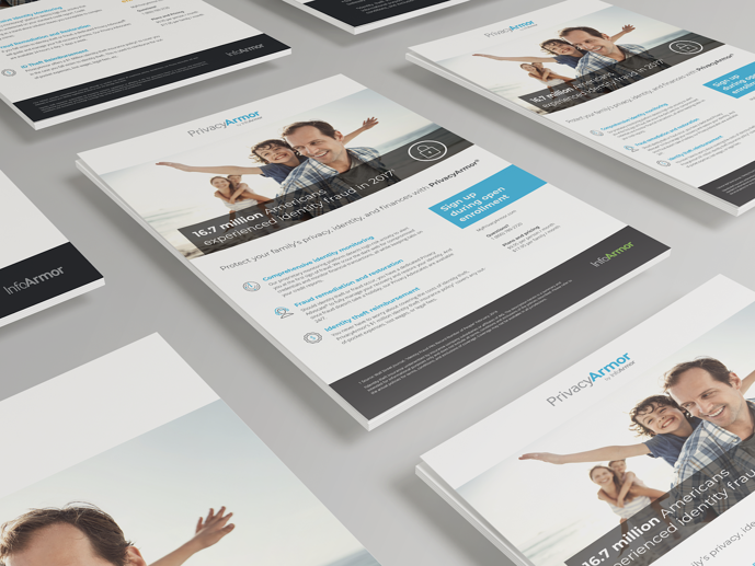
We are proud to offer two unique products. First, there is PrivacyArmor®, our industry-leading identity protection benefit for employees. Second is VigilanteATI™, our award-winning cybersecurity product for security professionals. In the past, we encountered difficulty representing each product, but we’ve solved this by creating two distinct product brands. This means that if you’re a PrivacyArmor member, you’ll start to notice emails and portals with the logo “PrivacyArmor by InfoArmor” instead of the usual InfoArmor logo.\

The mission continues
We love the new brand, and we hope you do too. But let’s not lose sight of what really matters — the incredible (and essential) services we provide our clients. While our look and feel may have changed, our commitment to excellence and creating a safer world never will.